Cotton Bureau Product Page

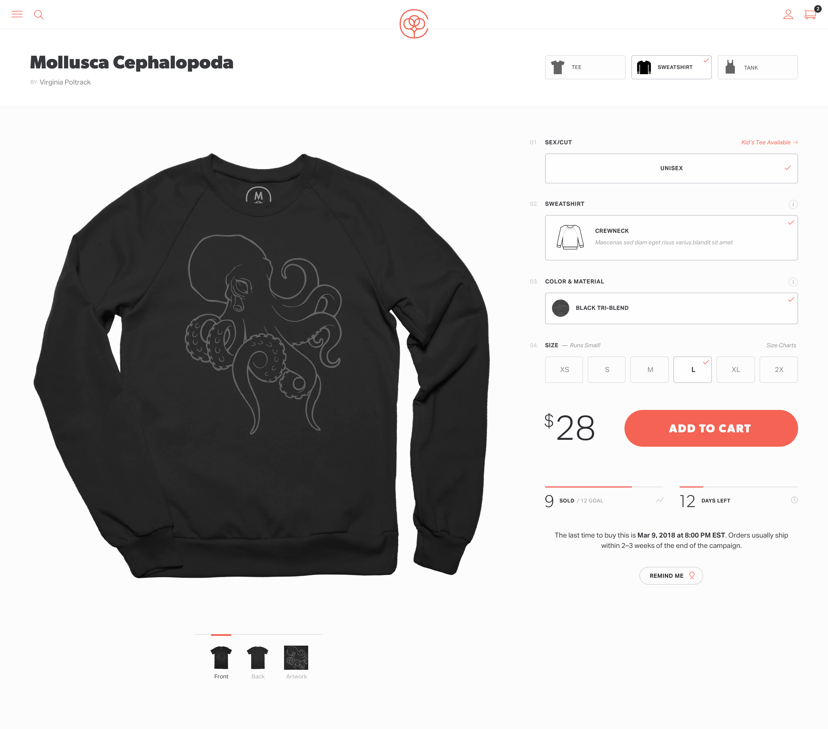
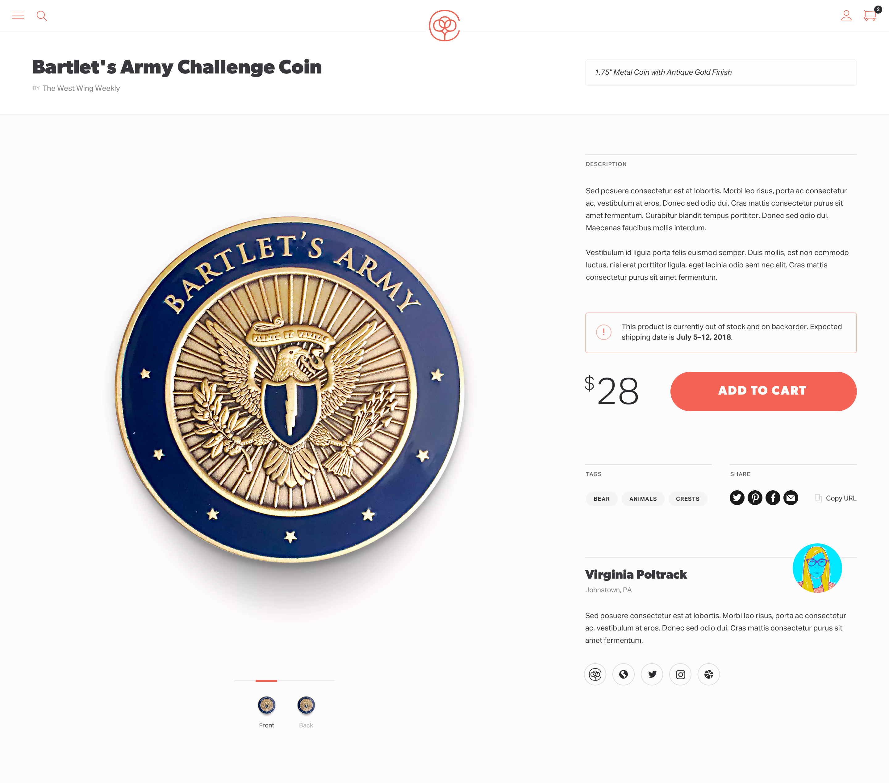
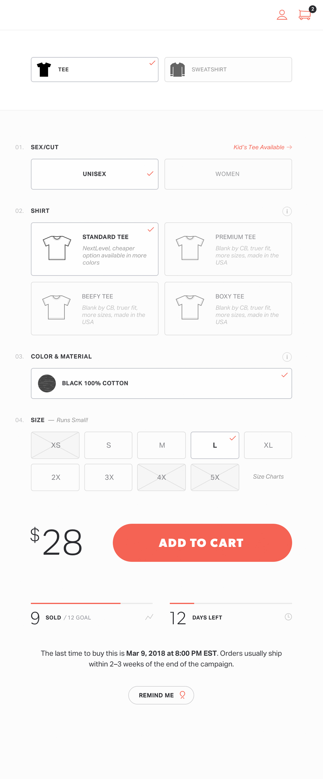
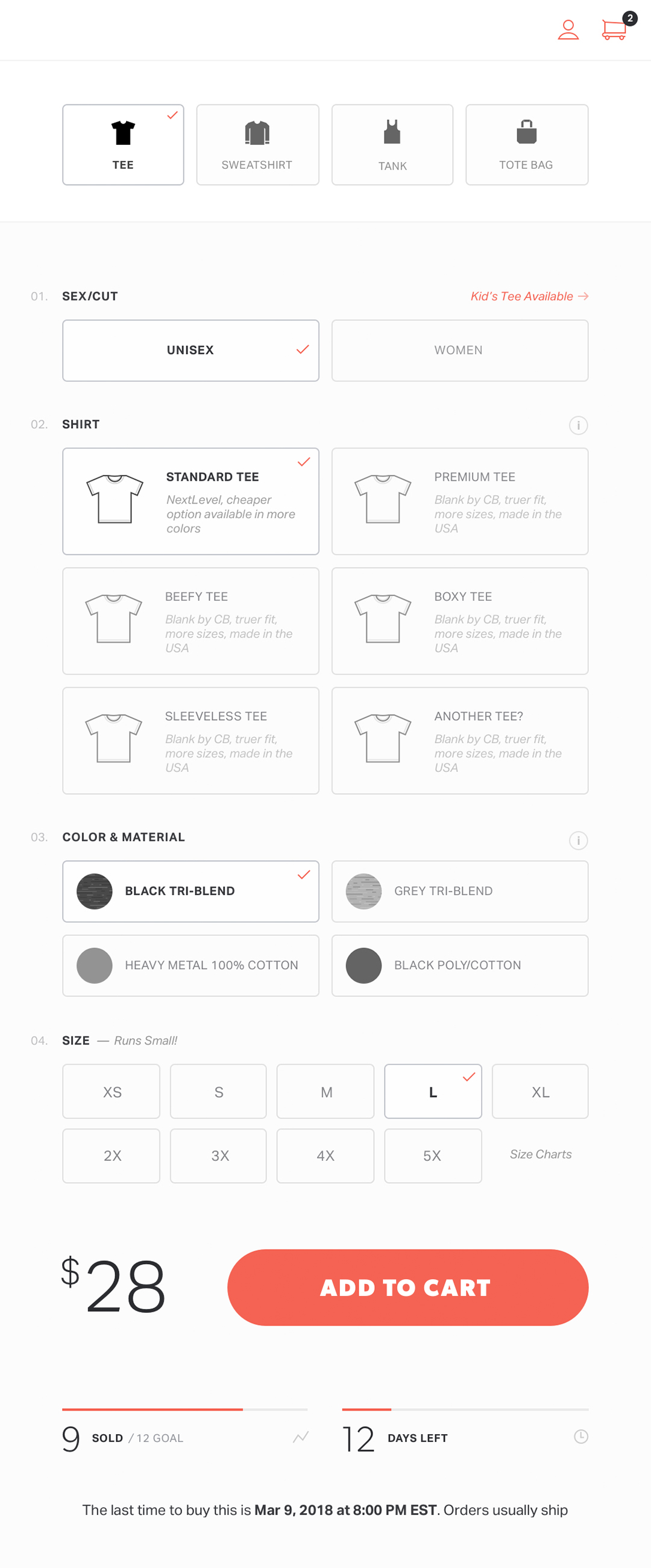
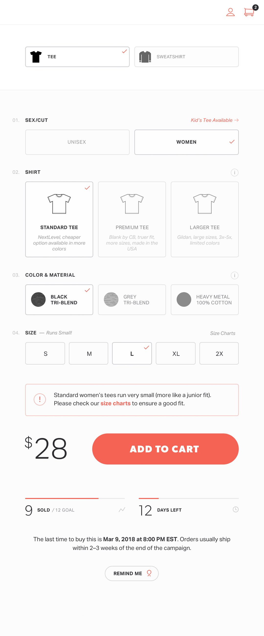
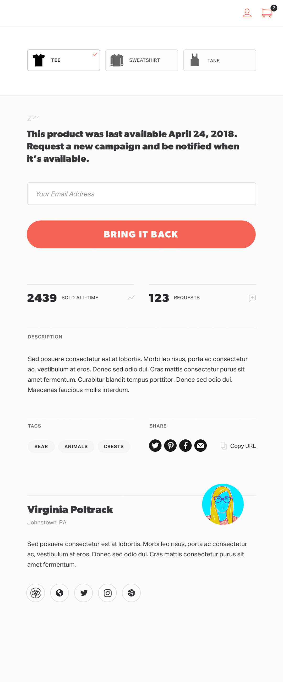
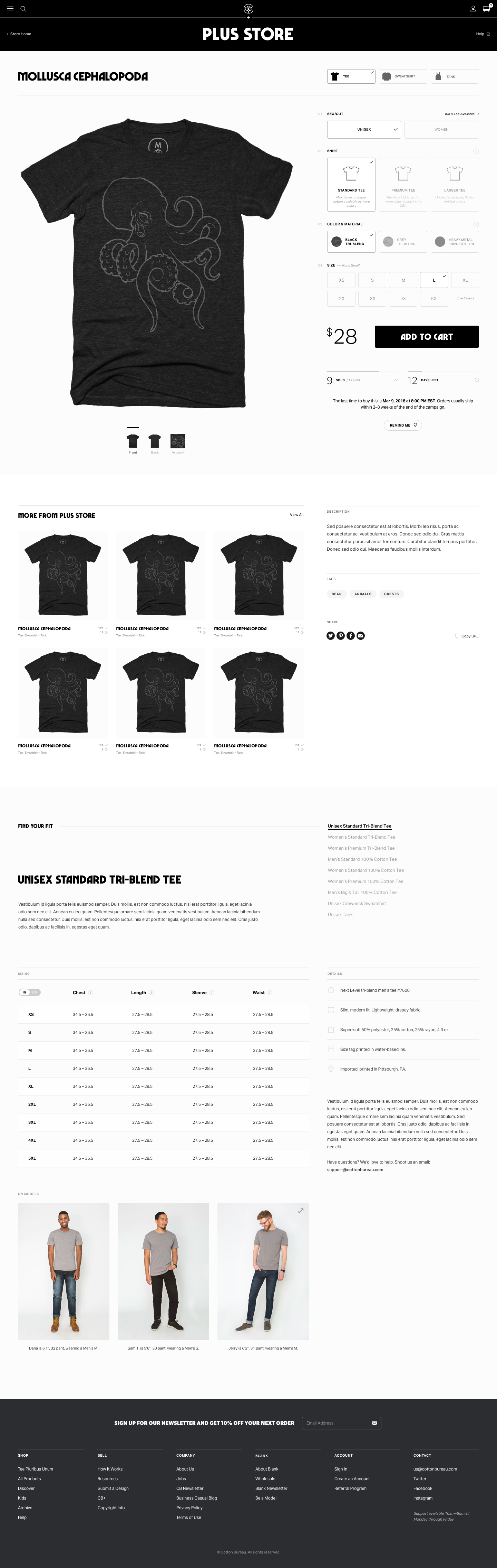
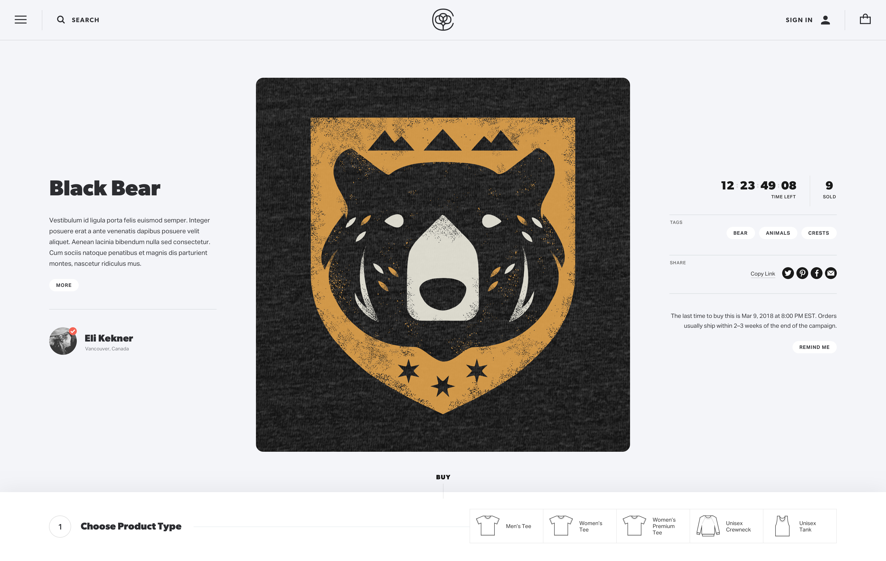
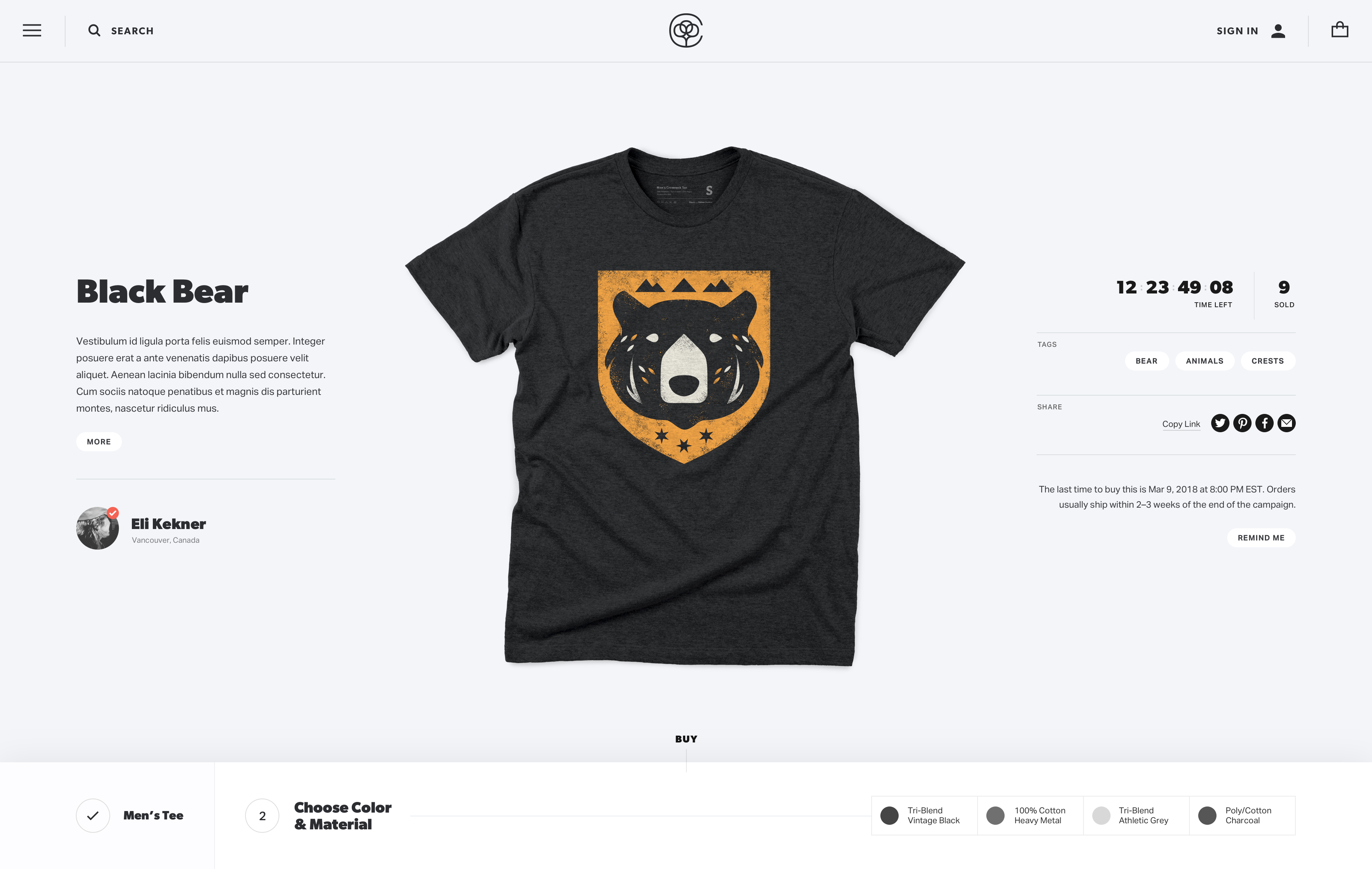
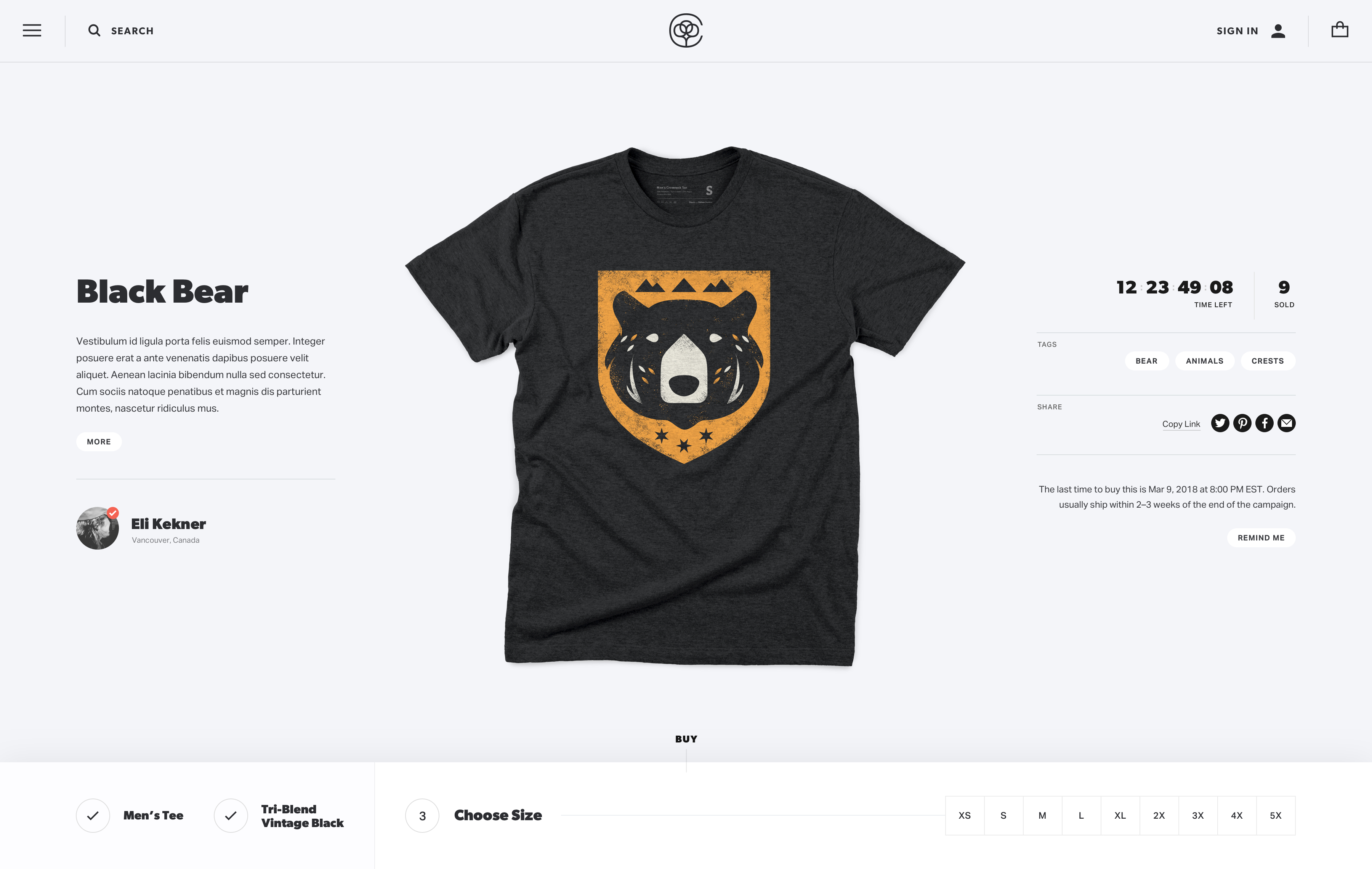
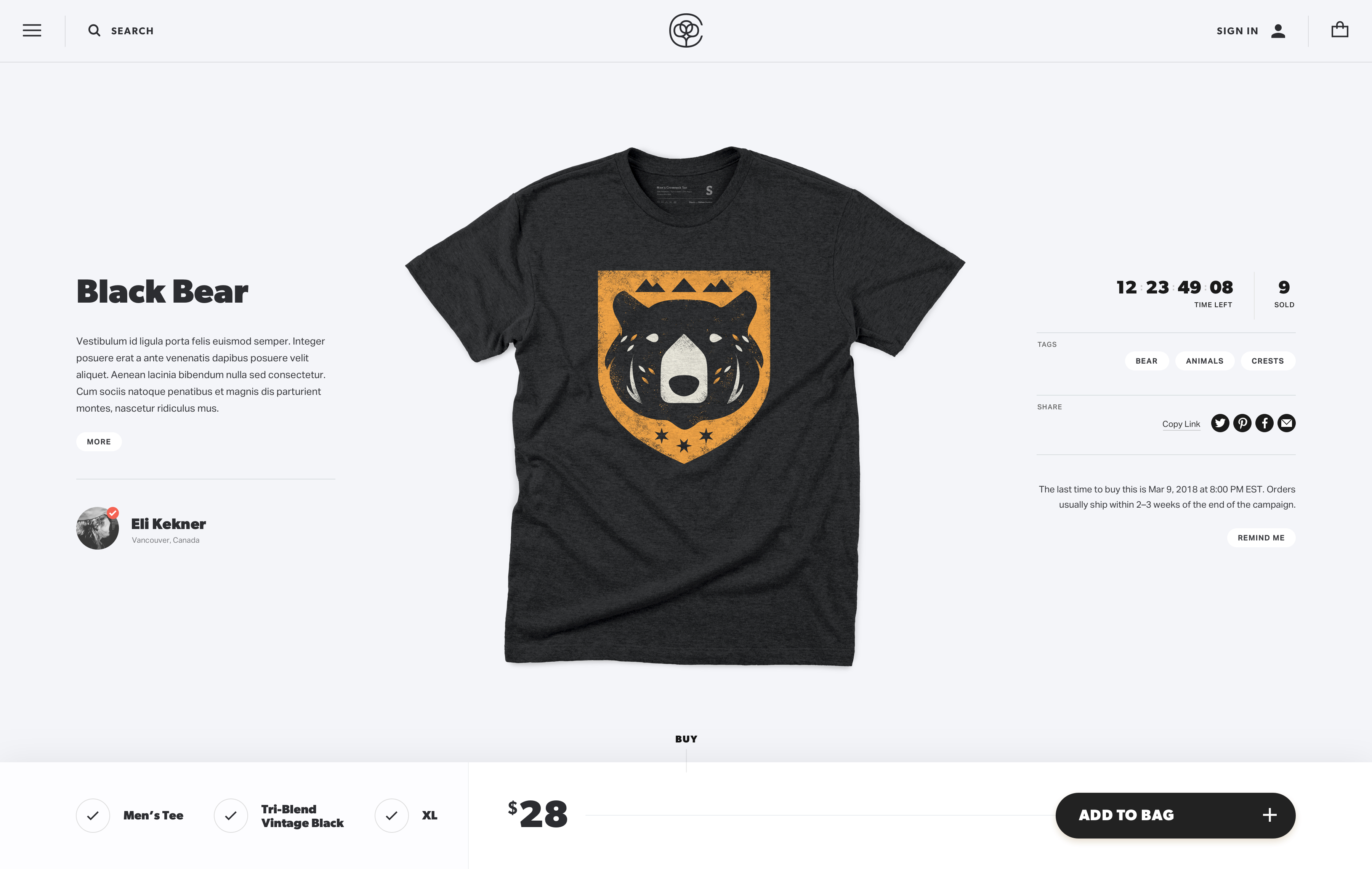
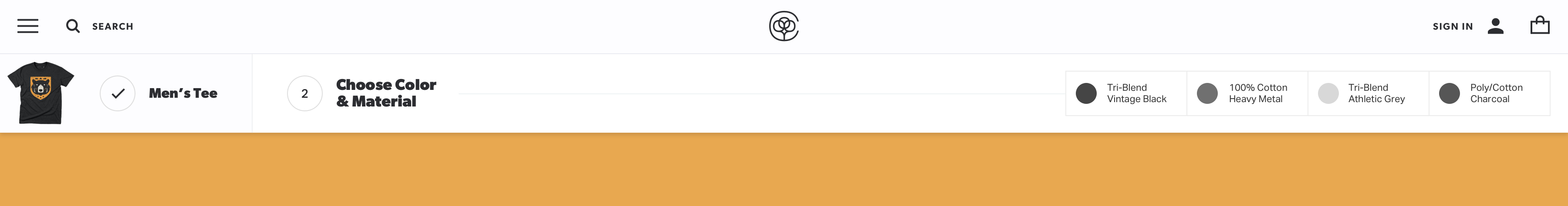
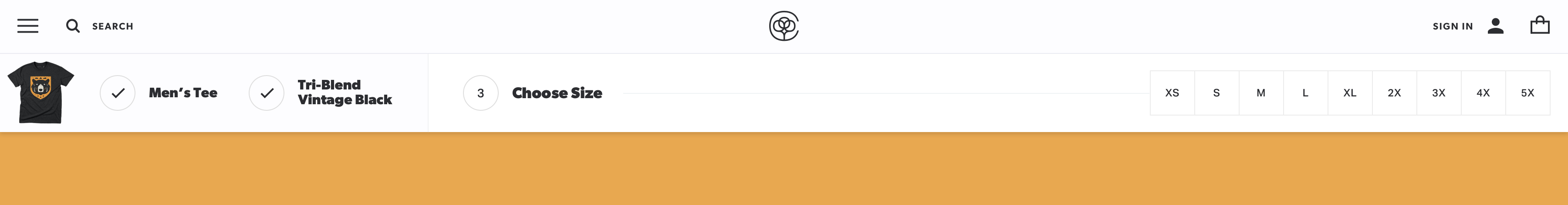
Early in 2018, we embarked on a comprehensive redesign. We began offering our own size-inclusive t-shirts as an option alongside the ones we've used for years, giving customers an option for the first time. This, combined with the emergence of non-apparel products on the site significantly increased the complexity of the purchasing experience.

Our goal was to come up with a system that could accommodate many different product configurations, successfully lead the customer through the various options, give the user resources and information about each available piece of apparel, and (since this is the entrance point for most visitors) present other products without overwhelming users.

All work done with the team at Cotton Bureau.


In an effort to present comparative information in an efficient way, we display all of the various options for a given product at all times. Seeing the options with a default option pre-selected helps educate the customer about different possibilities by example. It also let us streamline the process a bit for the most popular selections. A flexible grid system was designed to work seamlessly with different types of products with varying amounts of elements, without any manual adjustments.


The new product page layout needed to work within the constraints of our Cotton Bureau Plus partner stores. Steps were taken to ensure that the page design and its elements would accept each store's custom color palette and typefaces. The cross-sell area was adjusted to feature a given store's other products more prominently.


Alternate Concept

A number of different layouts and concepts were explored for experience of selecting and purchasing a product. The following design keeps the product dead-center within the viewport, flanked by its details. Actionable steps exist in a persistent bar fixed to the bottom of the screen. This creates more of a stepped experience, allowing the user to see only one set of options at a time.

The design itself is given much more attention than in previous iterations, a it is displayed as the product image prior to the selection of a shirt type. Besides potential issues with certain options breaking the linear progression (if a sizes are unavailable for particular colors, the user might have to continually jump back-and-forth between steps), we ultimately thought this was too much of a departure from eCommerce best practices for many of our users.

Alternate Concept

Because of the nature of Cotton Bureau's model, most traffic arrives on a product page through a link shared by the designer. Most users never see the homepage or any true index of products—just the product they landed on and possibly a few similar items that appeared in the cross-sell strip.

We explored what a themed landing page might look like for each product, letting the customer browse through the various garments available and providing more copy about each. Product options would be selected in a persistent header. Like the previous concept, we felt this put too much of a burden on the user to actively seek out and discover different pieces of information.